SFUSD: The Fresh Platform
{Re-defining lunch for a new generation}
Team: Naushad Huda (Creative Director), Cameron Sagey (Creative Lead), Usman Fahimullah (Product Designer), Diana Zahn (UX Researcher)

The Challenge
San Francisco Unified School District has been trying to implement what they call the FDE (Future Dining Experience), a new way to get lunch faster and more efficiently through the use of their SMTP (Smart Meal Technology Platform)
The Approach
SFUSD Came to Xtopoly to design out, both a front-end website for the students to interact with as well as back-end CMS Platform that would allow the admins to add food items as well as manage the front-end.
My role:
I led the overall UX strategy along with helping develop the visual language. Designing the UX for the user portal and the CMS system that the admins would have access to.
Discovery Phase
IDEO conducted user research with over 1300 participants and their findings were shared with us during the stakeholder meeting. With additional research on their findings, we gained a deeper understanding of our target audience, learned the objectives of the Future Dining Experience, their design recommendations, and the overall vision of the initiative.
Along with IDEO’s user research, at Xtopoly we also conducted our own user surveys from students and parents in SFUSD as well as the admins who currently manage the school lunch menus.
Middle & High School Students
Findings:
Technology Used: Mostly smartphones
Familiarity with Technology: Most students were familiar and comfortable with technology
Sites/Apps Most Visited: Games and social media platforms (such as Facebook, Instagram, and Snapchat)
How They Learn About Nutrition: Most students learned at home
Likert-Type Scale Analysis on Features:
Meal Planning: Rated 4 out of 5 in agreeing that meal planning would make it easier to eat at school
Meal Feedback: Rated 4 out of 5 in agreeing that providing meal ratings would help make healthier food choices

Student Nutrition Services Staff
Findings:
Demographic Data: Most staff members were females over the age of 35
Technology Used: Majority of staff used a PC
Familiarity with Technology: Majority of staff have never used a Content Management System (CMS) and those who did mostly used Wordpress
Tech Savvy: Average was a 3.8 out of 5, 1 being "I still call it the Intra-web" and 5 being "I can run Apple"
Likert-Type Scale Analysis on Features:
Meal Planning: Rated 4 out of 5 in agreeing that providing technology that enables students to make their own choices will increase participation in school meals
Meal Feedback: Rated 4.7 out of 5 in agreeing that allowing students to provide meal feedback will help staff make better decisions when designing meal plans
Class is in session.
To fully realize the FDE vision, we collated tons of research and data.
The users of this site are high school and middle school students from SFUSD. The platform is created to meet their wants and needs. They have certain expectations and frustrations as defined by our User Personas, which focus mainly on usability. We’ve done additional research on design aesthetic.
Takeaways
Nutrition information is displayed as the typical food label
Rating is either a 5-star rating system or a like/dislike option
Images of food are available on some but not all
Only one application offers educational food games
Opportunity
Present nutrition information in a relevant way
Provide a more engaging/relevant to audience rating system
Provide images for all food items
Educate users through games


Let’s Take Roll
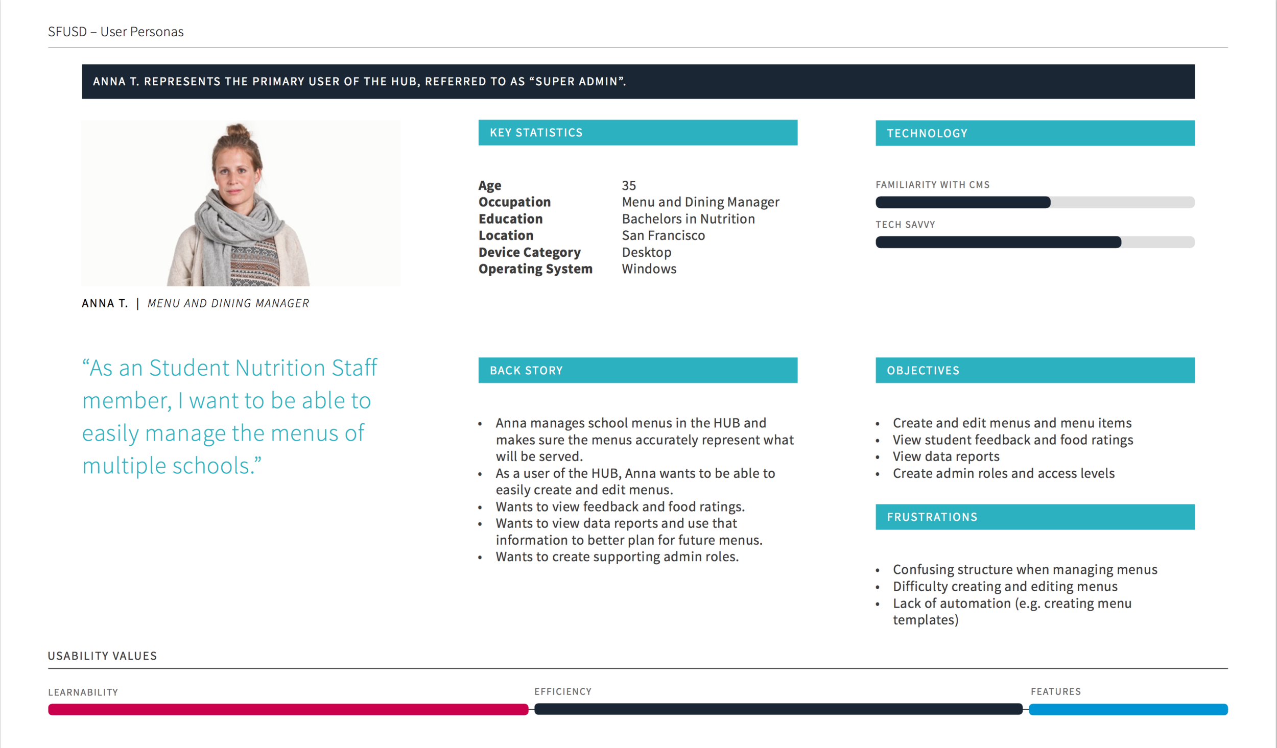
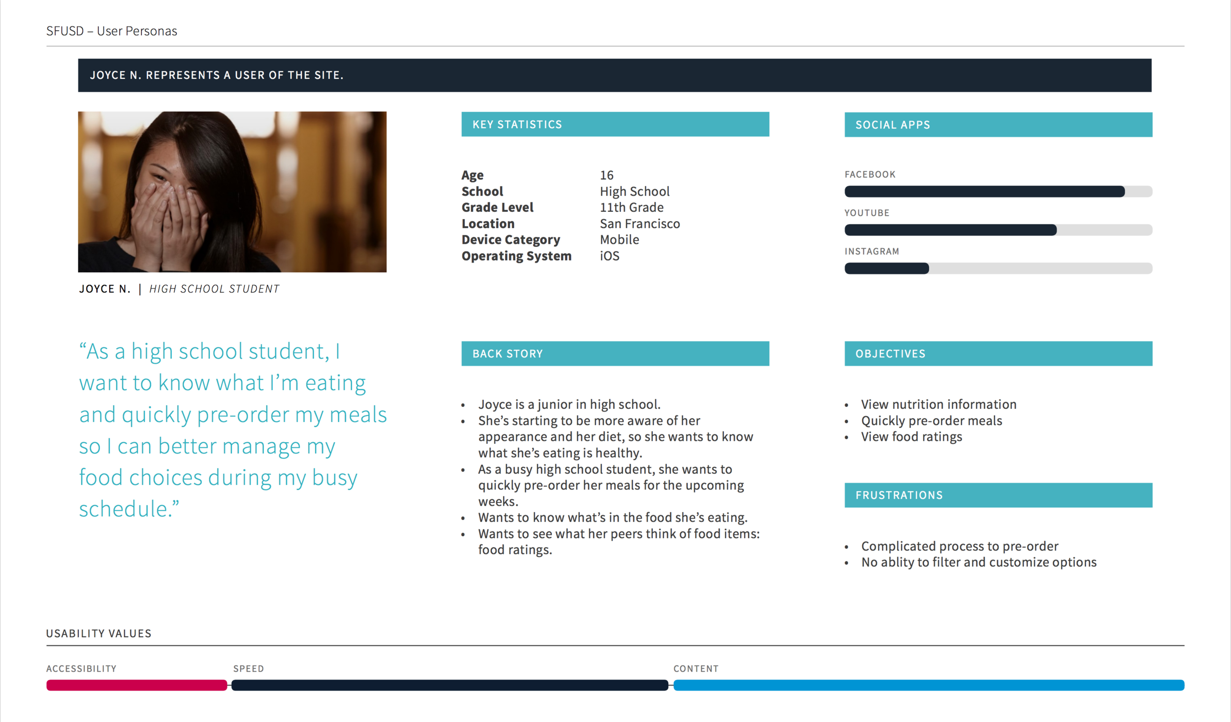
Our personas.
Using the information from IDEO's research and the user surveys conducted, we created our 3 primary user personas. We have 2 users for the student-centered responsive site and 1 user for the Content Management System.

The class schedule
We mapped our different Use Cases and Usability flows for the portal which students use and the hub which the admin use.

The User Journey
The platform had a new feature called "Pre-Order Meal" where students were able to plan, choose, and order their meals ahead of time. In order to better understand this process, we created a user journey. This helped us to organize the user's goals through the process, their expectations of the platform at each stage, and helped us pinpoint opportunities for improvement.
The Seating Chart
The sitemap allowed us to organize and structure each page. We showed how the personas related to the site map by showing which pages the persona would prefer to use.
There’s two site maps: one for where the student-facing portal and the other is for the admin Hub
Show your work.
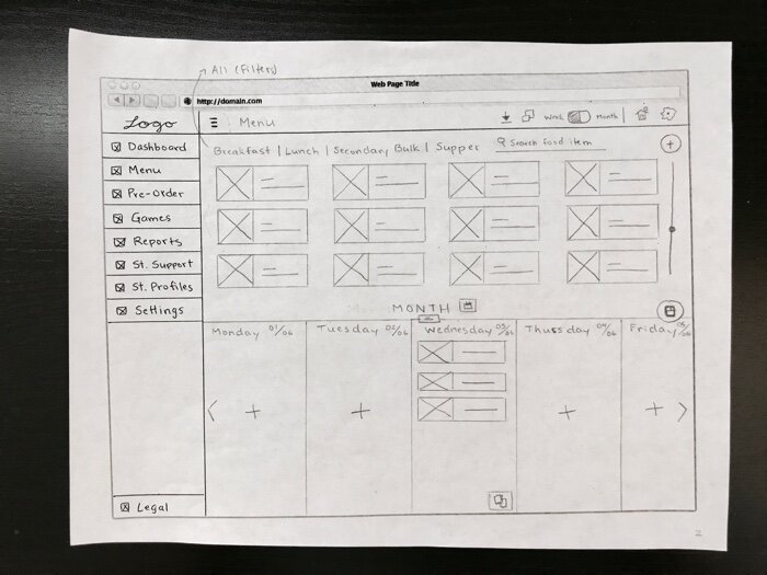
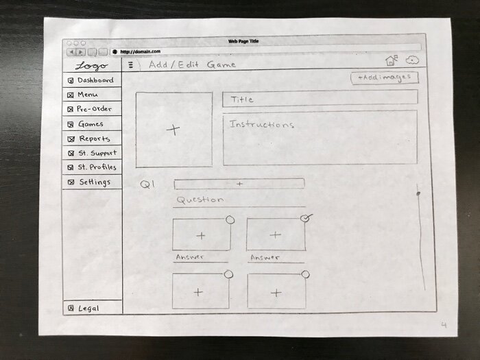
Before doing any wires or interface design. We did a whiteboard session to translate our sitemaps into rough wireframes. Afterwards we did more sketches to nail the experience of the fresh platform


Hi-fidelity Wireframes
After sketching we began to digitize and refine the experience. With the wireframes we solidified the experience for the front-end and conducted usability testing with students to see where the current experience needed improvement before beginning the visual design.


Usability Testing
After the wireframes were completed, we created a prototype for usability testing. We gathered a few students that met our user persona characteristics and brought them into the office for testing. We created a usability test script that I followed during each test to ensure all instructions were clearly explained and covered. This also ensured all participants had the same testing experience.
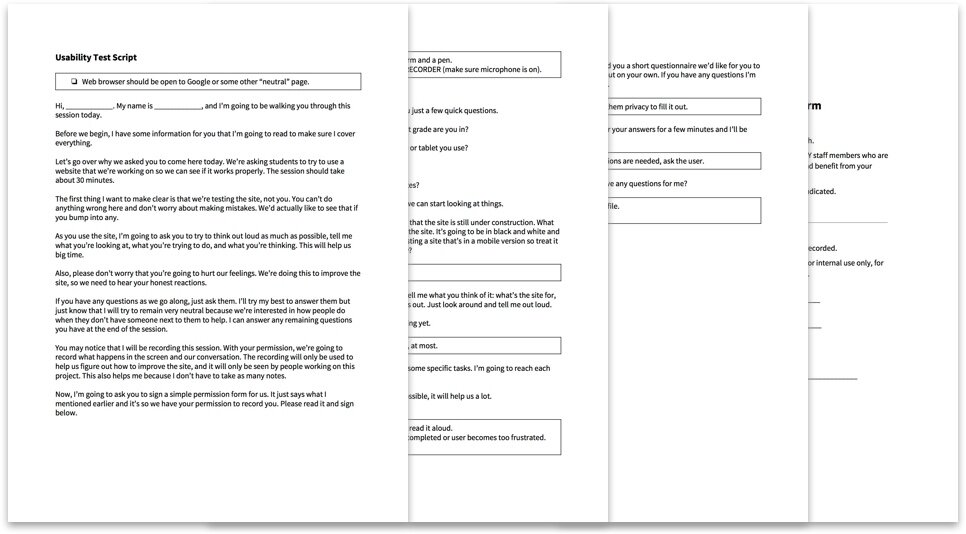
We created a usability test script that I followed during each test to ensure all instructions were clearly explained and covered. This also ensured all participants had the same testing experience.

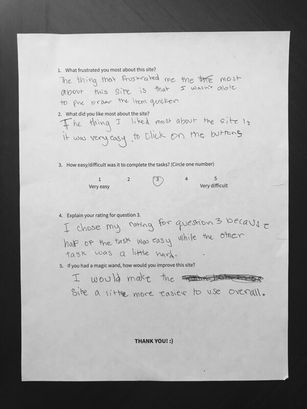
We asked students to fill out a post-test questionnaire to collect further information on their experience.
Here’s a snippet of one of the usability testings conducted. This is a middle school student.
Findings:
Most users found the point system really fun and interesting, we had implemented levels and badges they can earn when they level up
The pre-order process was completed easily by most of our users.
The successes and failures witnessed during user testing allowed us to prove certain of our design decisions worked, but highlighted others that we had to improve on. We gathered this data and made changes to the wireframes to optimize the experience.
The Design
The site will use vibrant colors to symbolize health, a wide variety of colors to symbolize choice, a clear and spacious layout for convenience, and a friendly and inviting design style for inclusivity.
Junior high and high school students want to be socially accepted. A huge part of this is being cool, doing cool things, and going to cool places. The students need to feel comfortable using this site and eating in the cafeteria. This site needs to be hip, trendy, fun, and useful.
The Fresh Portal
The Fresh Portal uses bold imagery, and fun UI elements to make ordering lunch easy
Home: Here students can get an overview of the different activities offered on the Fresh portal
Home: By doing activities on the portal such as pre-ordering, playing games etc. Students can level up and earn achievements.
Pre-order: Students can view what items they’ve pre-ordered as well what days are available to pre-order
Pre-order: Students select the lunch item they want on a specific day
Meal Page: The meal page shows healthy facts as well ingredients and if there’s any allergens.
The Fresh Hub
The Fresh Hub is how the admin’s set the lunch menus, check pre-orders, and add items for students to view
Login: Every Admin has to enter their credentials to gain access to the Hub
Dashboard: The dashboard is a jumping off point as well as an quick snapshot of what’s happening on the portal
Dashboard: Admins can create menus by dragging food items into each day on the week.
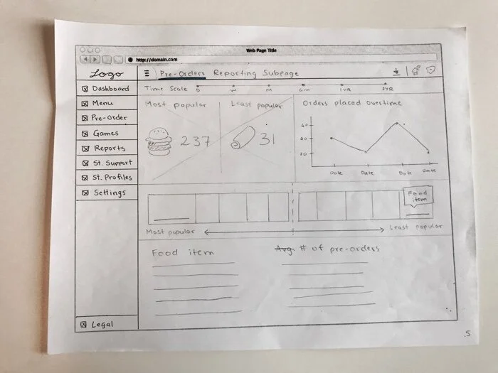
Pre-orders: Here the admins can view how many food items students are ordering per day.
Add an Item: If a food item is missing or is new to the system an admin can create a new food item for future use. If a food item is no longer being served it can also be deleted as well.
Key Takeaway
Our team at Xtopoly poured our hearts into this project! But sadly, SFUSD was dealing with budget cuts and this project got the axe. Even though the project is now a pipe dream, the fact that we were able to craft such a well thought out system both for students and those that will be managing the platform, really showcased how powerful design can be.